Kitchen Part Two – Creative Continuity

Or: Color, Texture, and Patterns
What if you designed a kitchen to incorporate a century's worth of design and fashion, like it had organically grown as a space over that time, instead of feeling like it were brand new? What pieces would come and go over a span that large, and how often would those changes have taken place? How did the way we interact with kitchens change between 1920 and now, and if someone from back then had access to the same appliances and materials we do now, what would they have chosen?
Those were the kinds of questions that went into this kitchen design, as we didn't want a space that felt out of place within the rest of the house, or like it were necessarily built to some exacting vision. The spaces we live in are as organic as we are, so while we strive for cohesiveness and maybe dream in exactness, reality is anything but. We only have so much energy to change these spaces over time, and some battles are too great to pick. Maybe hiring a contractor to change your cabinetry every thirty years isn't a huge deal, but completely redoing the light switch placement you've got strong muscle memory for, is.
So, where do you begin?
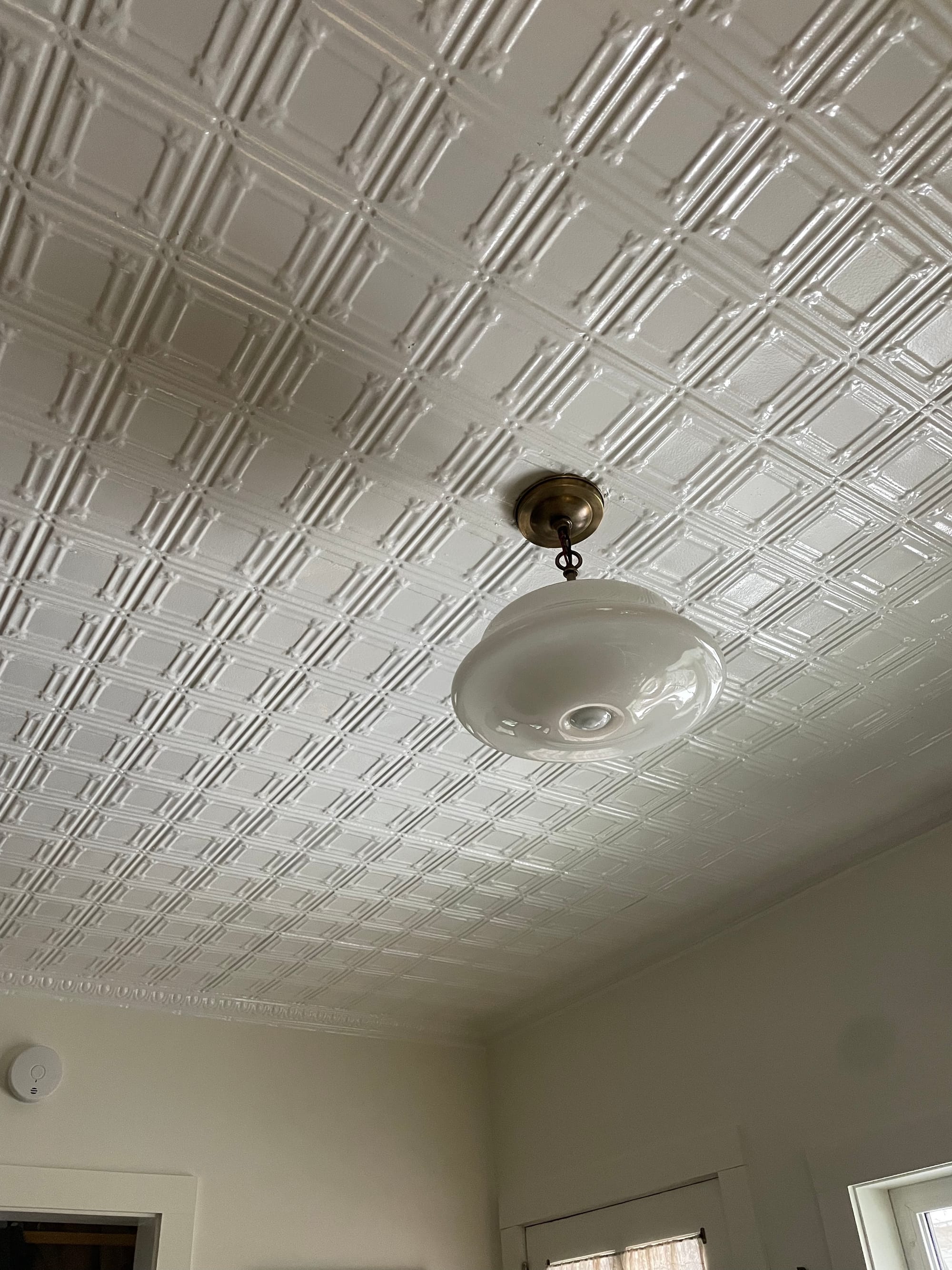
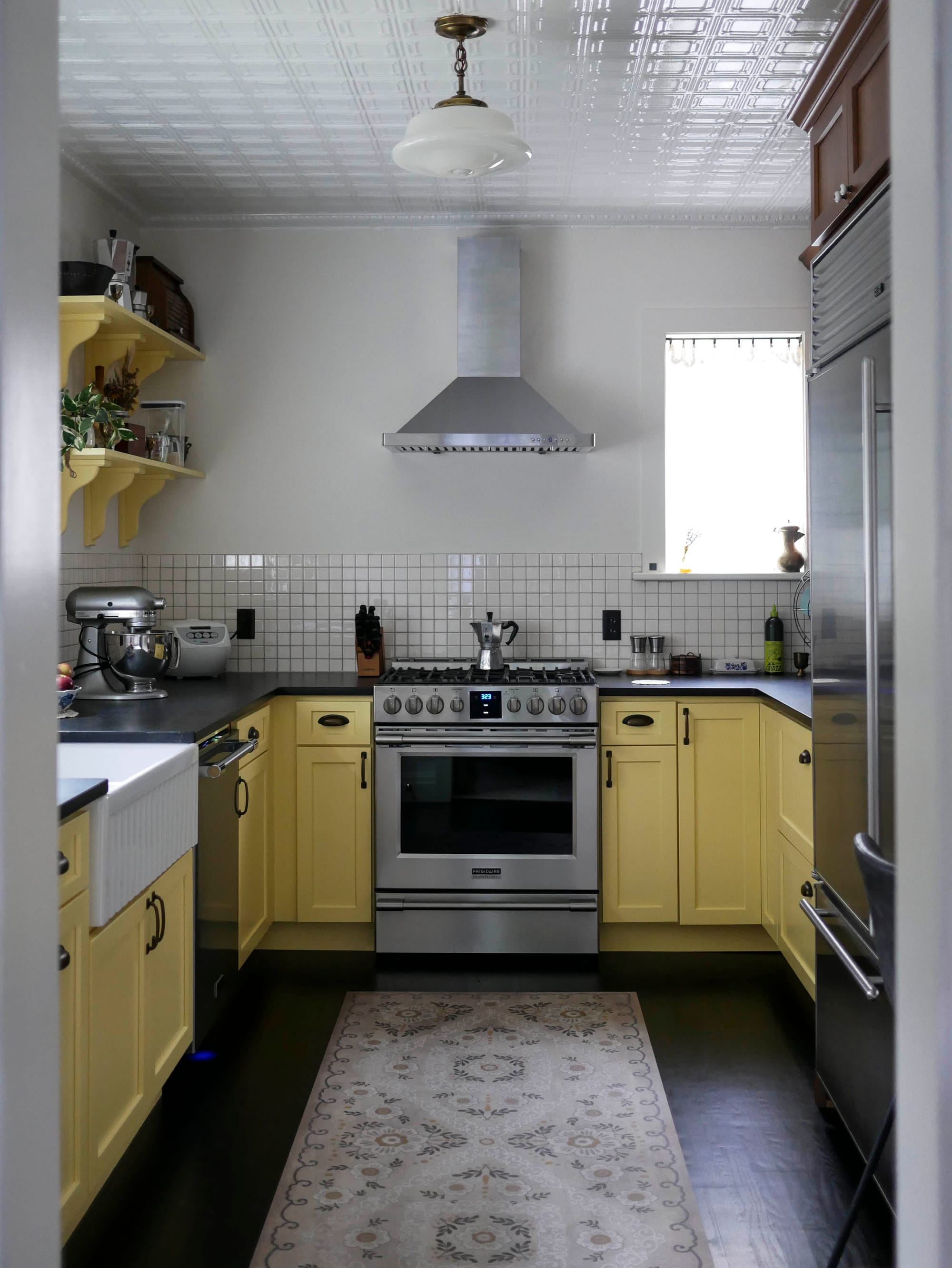
Look inward. No, really, look at what you already have and find an anchor. Ours was the tin ceiling. Being one of the little details that sold us on this home, we knew that wasn't going anywhere, and so it became an anchor element of the design. We also have a built-in in the adjacent dining room with simple brass cup drawer pulls—another anchor. Around the rest of the house, we'd been collecting and installing milk glass schoolhouse lighting fixtures, and various hobnail lamps. Anchor.
Okay, so what do we do with these pieces we've identified? Are there patterns you can pull inspiration from? Textures that can springboard direction? Maybe a link to an antique architectural catalogue you once leafed through?
Jennifer (see part one if you haven't met her yet!) was the master of this. She introduced us to the verbiage with which we held onto for the entire project:
Continuity.
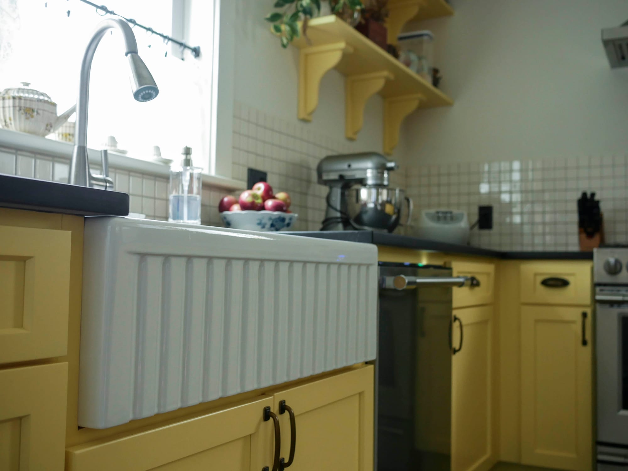
The square pattern in our tin ceiling? That provided the direction for the 2" square backsplash tile.
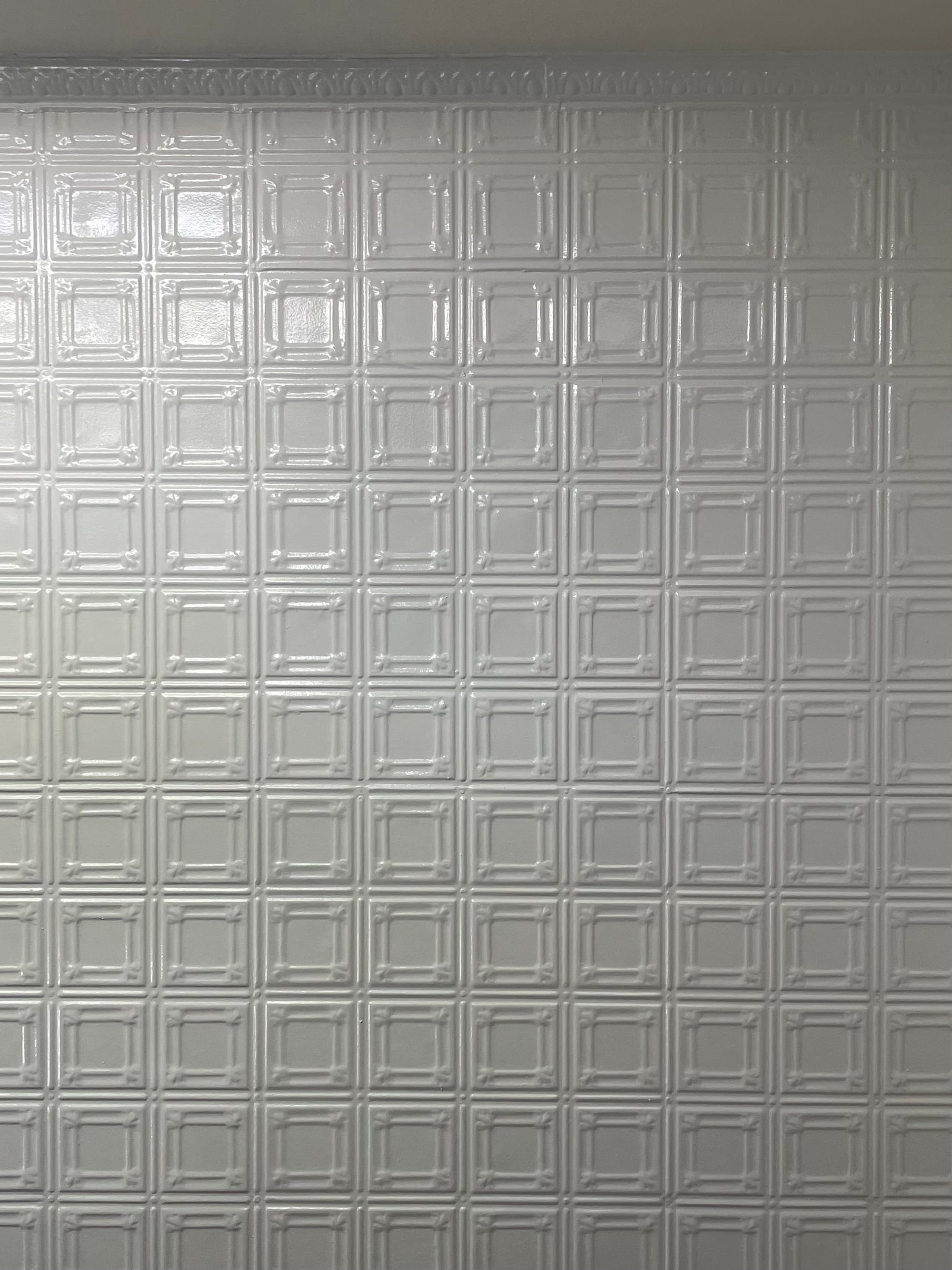
Tin ceiling, 2" square tile backsplash
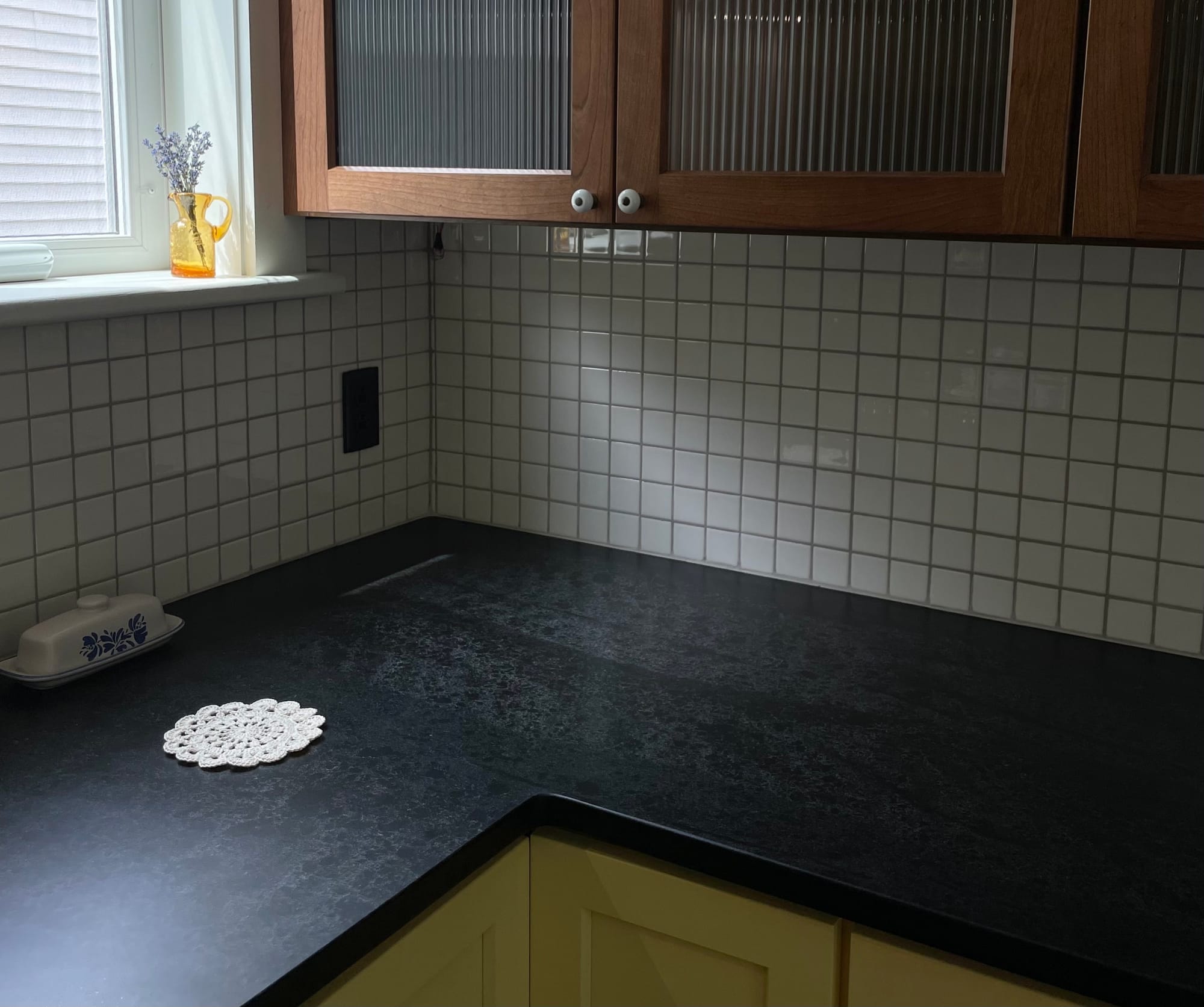
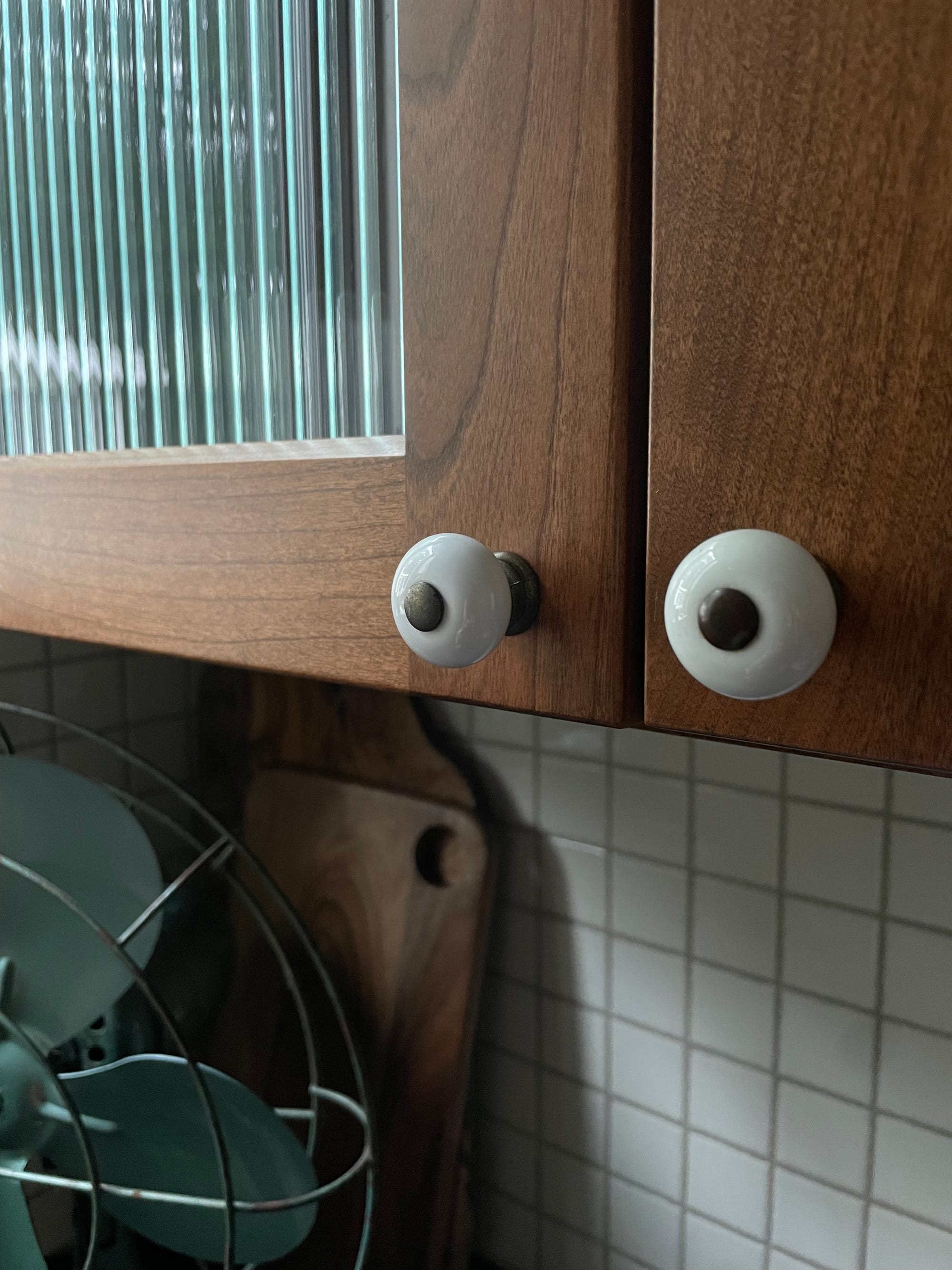
Reeded glass cabinets? Holophane sconce shade.
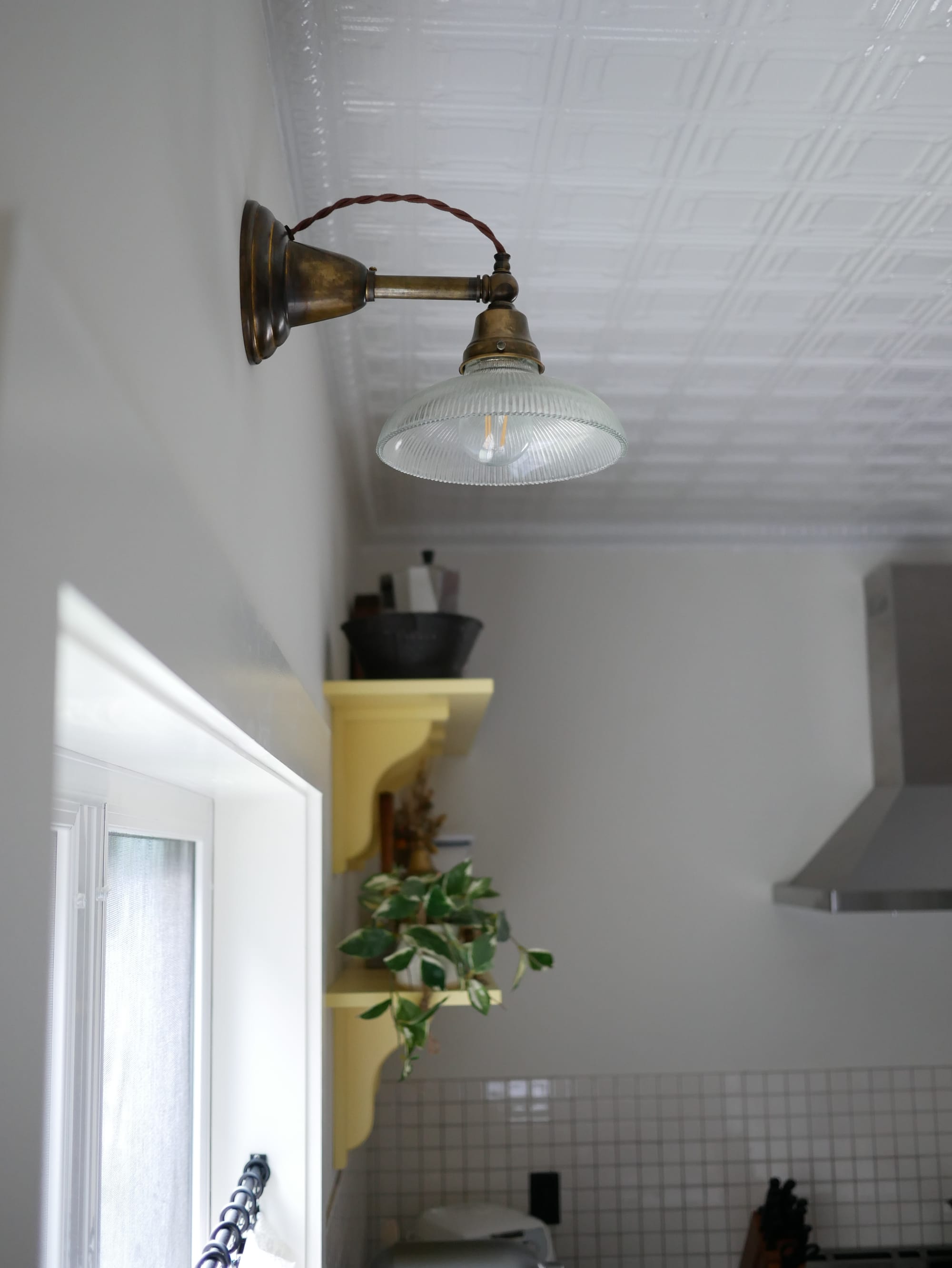
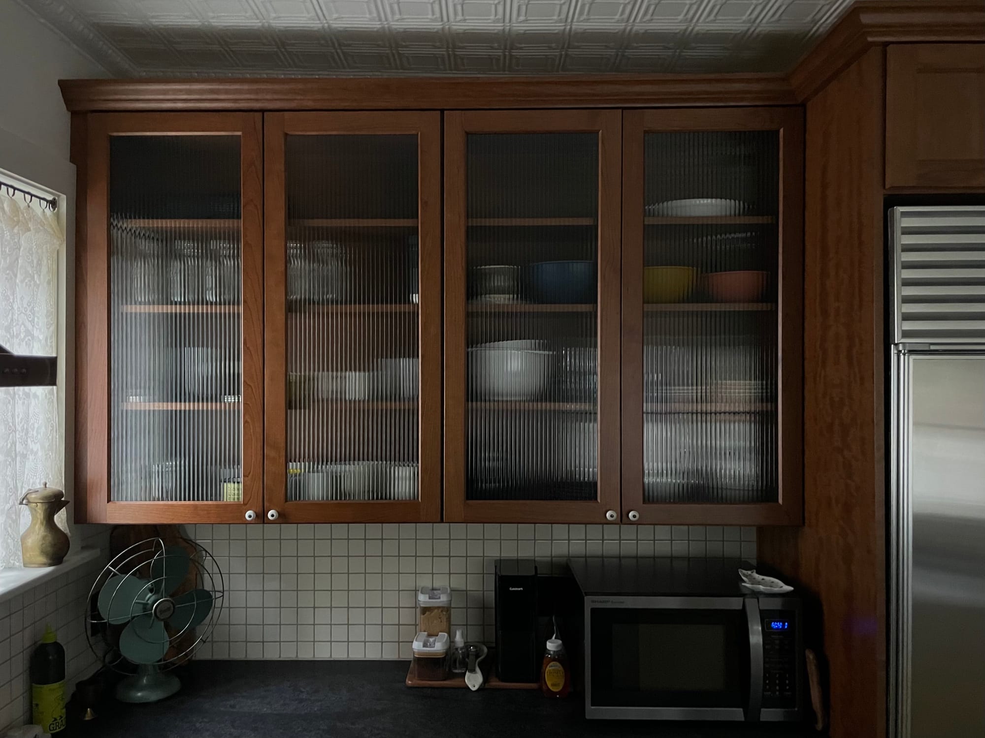
A sconce with a round holophane glass shade, and a row of cabinets with reeded glass inserts.
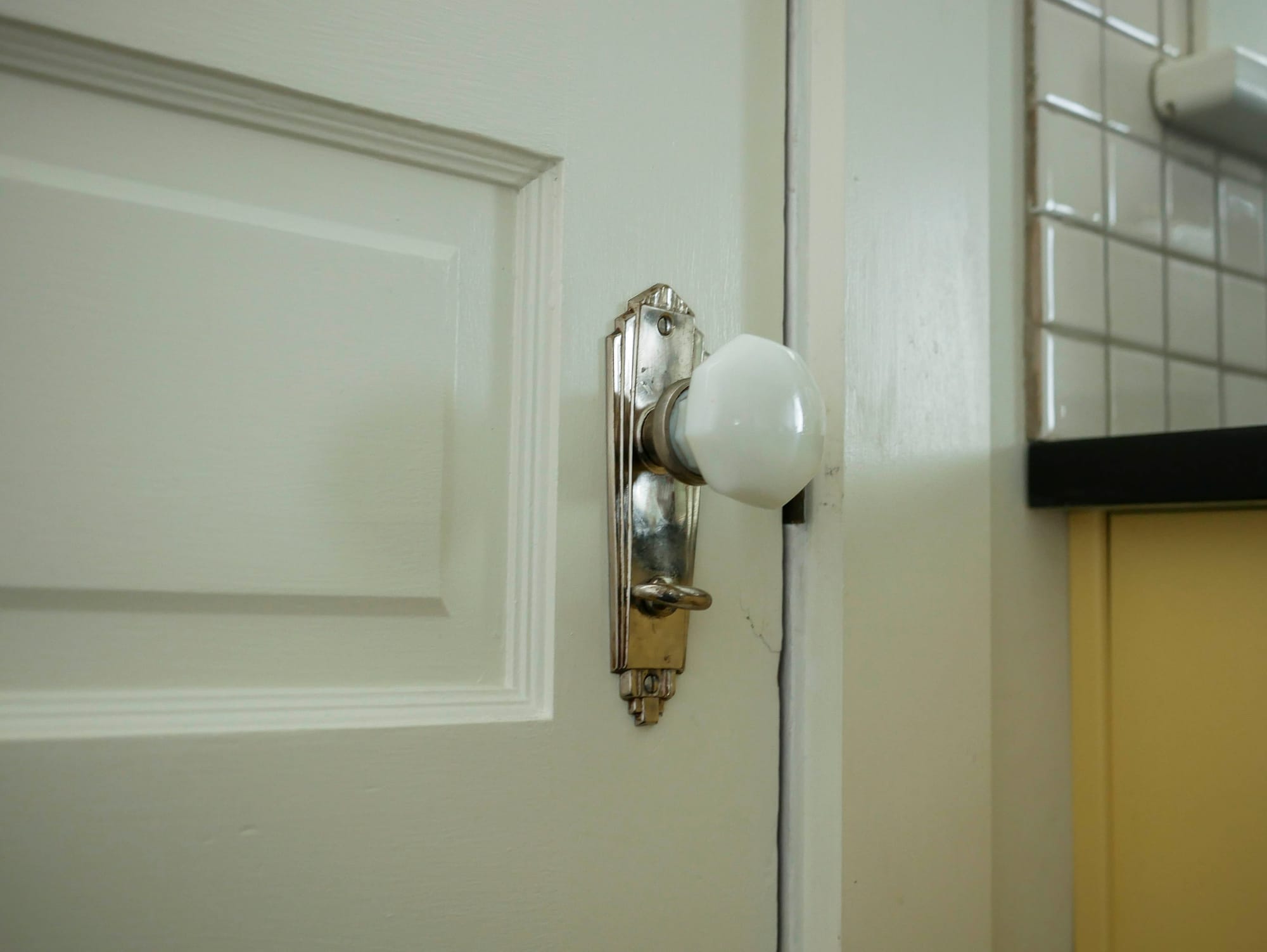
The milk glass from the light fixture led to milk glass cabinet pulls which led to a milk glass deco style door handle which led to a hobnail milk accent lamp.
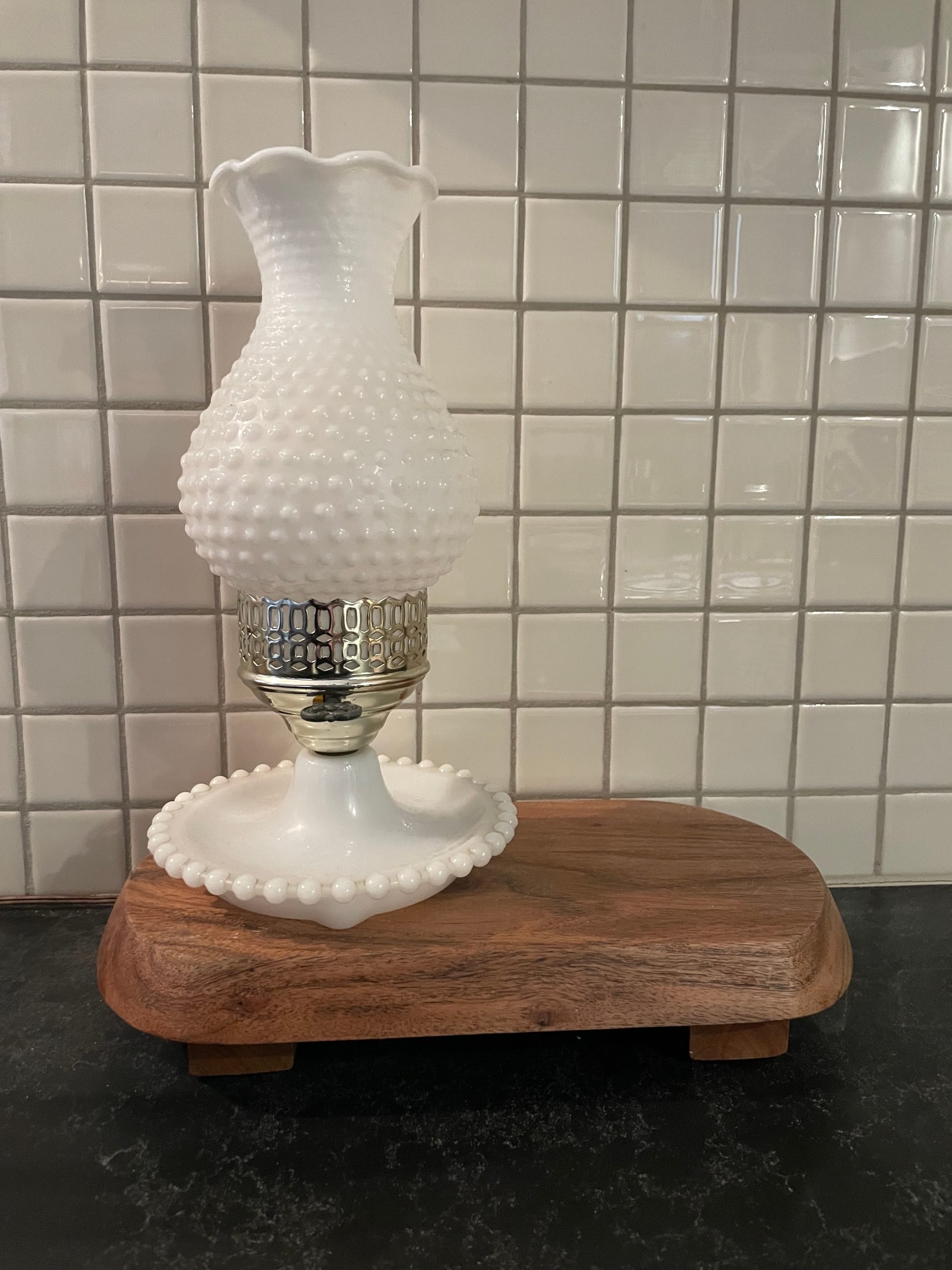
Continuity.
What really made this approach work was also where these items were placed. Ceiling and backsplash are on two different planes, never touching directly, but offering a subtle partnership between what you see in front and what you see above. The milk glass handles and the schoolhouse shade can be seen visually in the same line of sight, but scale is at play here, strengthening their synergy. The reeded glass and holophane shade are on opposite sides of the kitchen, bringing a balance to the elements.
We didn't just choose and place details because we liked them—we put a lot of thought into each choice we made, trying to balance aesthetic, cohesion, and practicality. This is the kind of nerdy shit that happens when a designer hires a designer...
Let's go back for a second.
Make no mistake, the design did not come together as easy as the above makes it sounds. As with any creative project, there was a lot of fumbling around trying to make sense of our inspiration, feel a spark with various mood boards, and hone in on the discussions and discovery we did with Jennifer early on.
In the beginning, everything was pink.
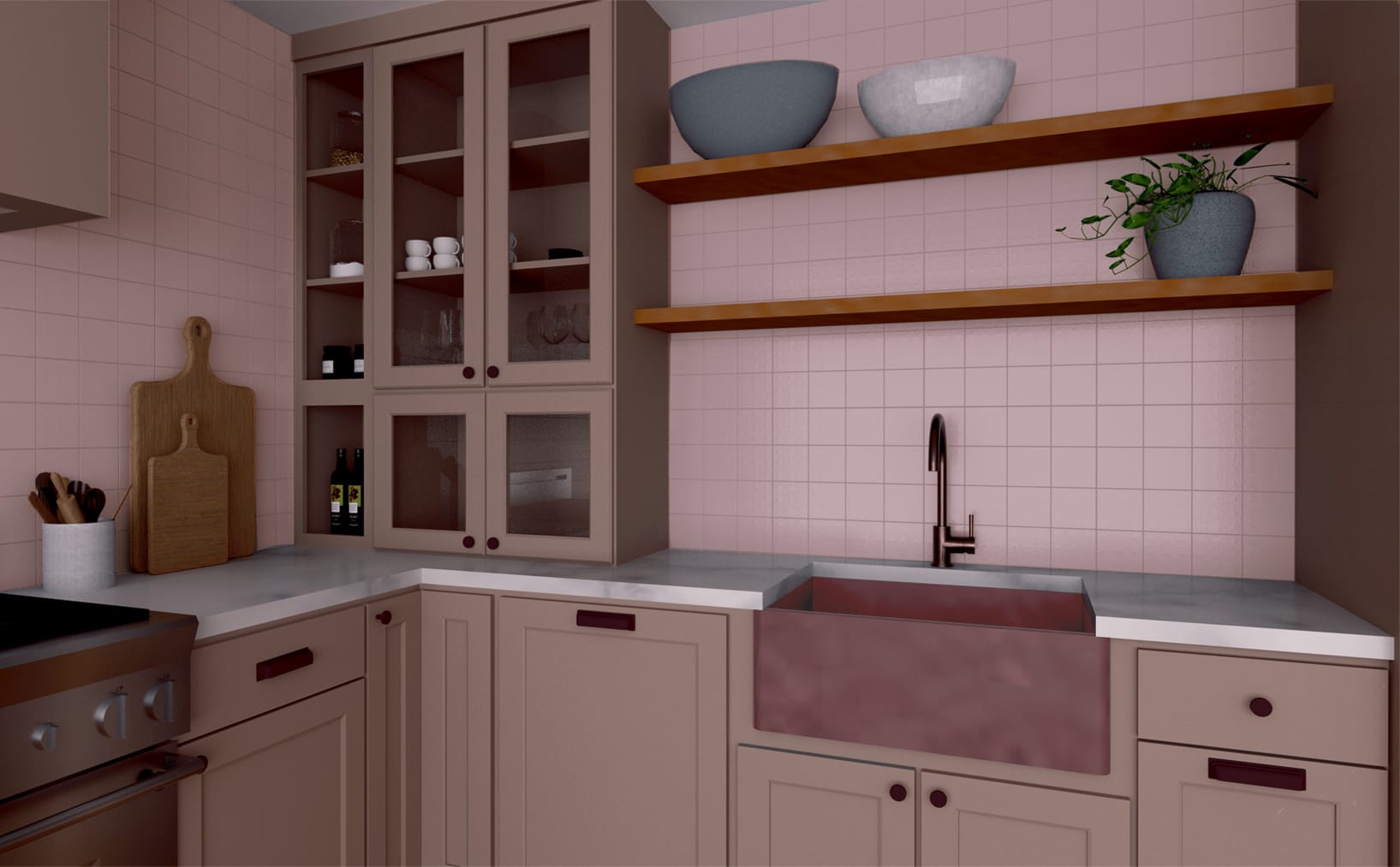
We've tried to make pink work in this house in the past, but, pink is hard. When you consider how a color will look in all lighting levels, color temperatures, under shadow, etc., you realize 'color' is subjective. The kind of pink we wanted (a dusty rose/mauve) would always, without fail, look like grey matter in low light/shadows. Considering we only ever turn on the "big light" when cleaning, low light was to be considered the standard experience in the kitchen.
When we came to the conclusion that pink wouldn't work, we said," what about yellow?" If you know me (Krystal), you know that this was a wild departure from my norm—I'm typically very anti-color. As a Scorpio born on a full moon two days before Halloween, my aesthetic has always been more Bram Stoker's Nosferatu and less Breakfast at Tiffany's.
However, the beauty of a partnership is knowing which parts of you to hold onto and which parts to be a bit more flexible with. I embraced a yellow kitchen, knowing I would get black elements elsewhere. 😈
Jennifer came to visit with a few paint samples, and we picked a warm buttery yellow for our cabinets—derived from a mid-1960s kitchen color palette. Since we were going bold with the cabinet and countertop, the walls remained a simple, neutral ivory. The tiles would also be ivory instead of bright white, to keep the contrast with the walls to a minimum. The countertop would approximate the Nightfall swatch, as we were planning to source something that resembled slate, but something hopefully more durable than.
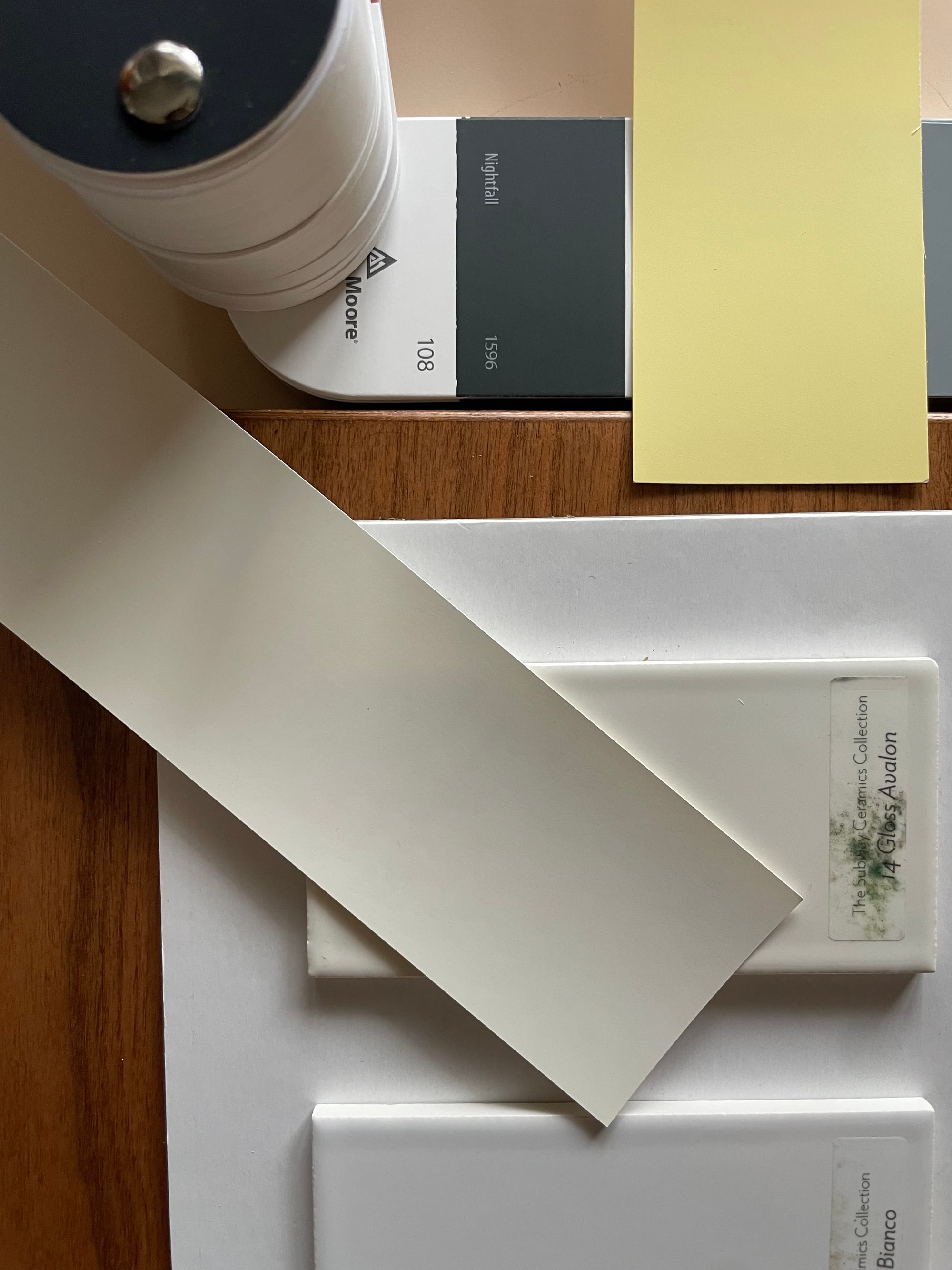
We chose to give the tin ceiling a fresh coat of high gloss bright white to make it look brand new and draw the attention it deserves. To this day, this is one of the decisions that I think was so simple, yet turned out to be so, so powerful. The texture of the ceiling now pops!
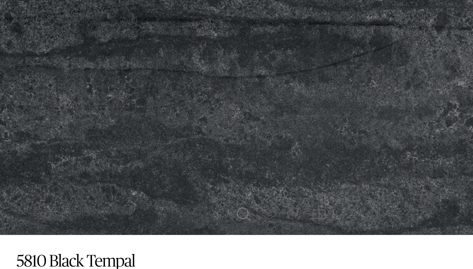
The countertop we ended up with was Ceasarstone Black Tempal quartz, which is the perfect soft black with a marbled texture.
Patterns
Hopefully if you've read this far, you've realized how intentional we were trying to be with every decision. To the outside viewer it might seem to be a little much, but it's worth pointing out that kitchens live in very long timescales compared to other rooms in homes, and we targeted (at least) thirty years. It's not just functional decisions, either, like where you place the sink or the stove, but creative decisions that have to balance practicality, aesthetics, and visual cohesion.
Much of the cohesiveness of the creative continuity is based on patterns. Earlier, you saw the holophane shade and the reeded glass in the cabinetry calling back to one another with vertical lines, then the tin ceiling and the tile backsplash representing a grid of squares. But where else did pattern play a role? Zooming in a little bit, the linear verticality continues with the scalloped ridges in the sink and the textured ridges in the vintage brown Uniline outlet plates.
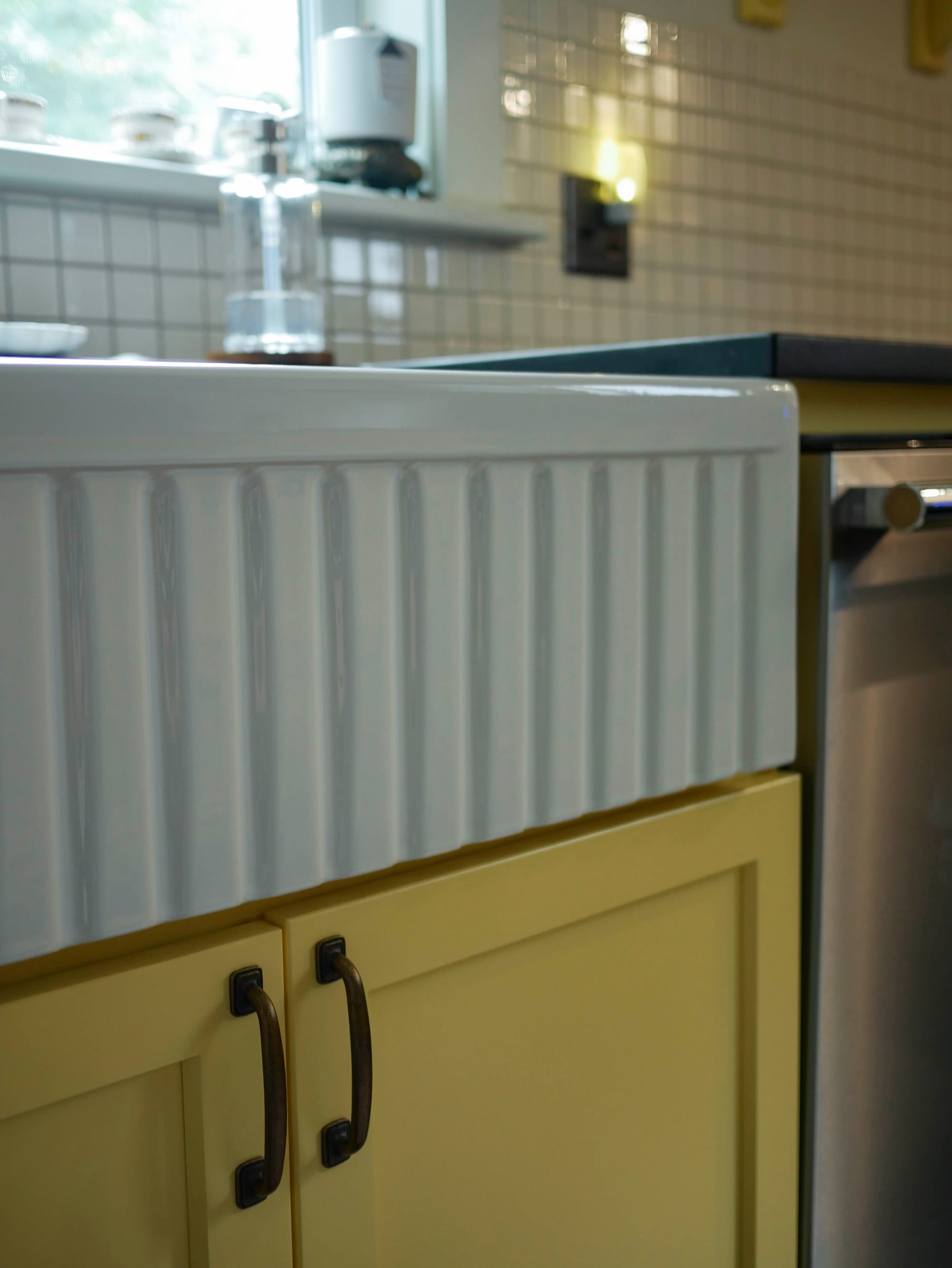
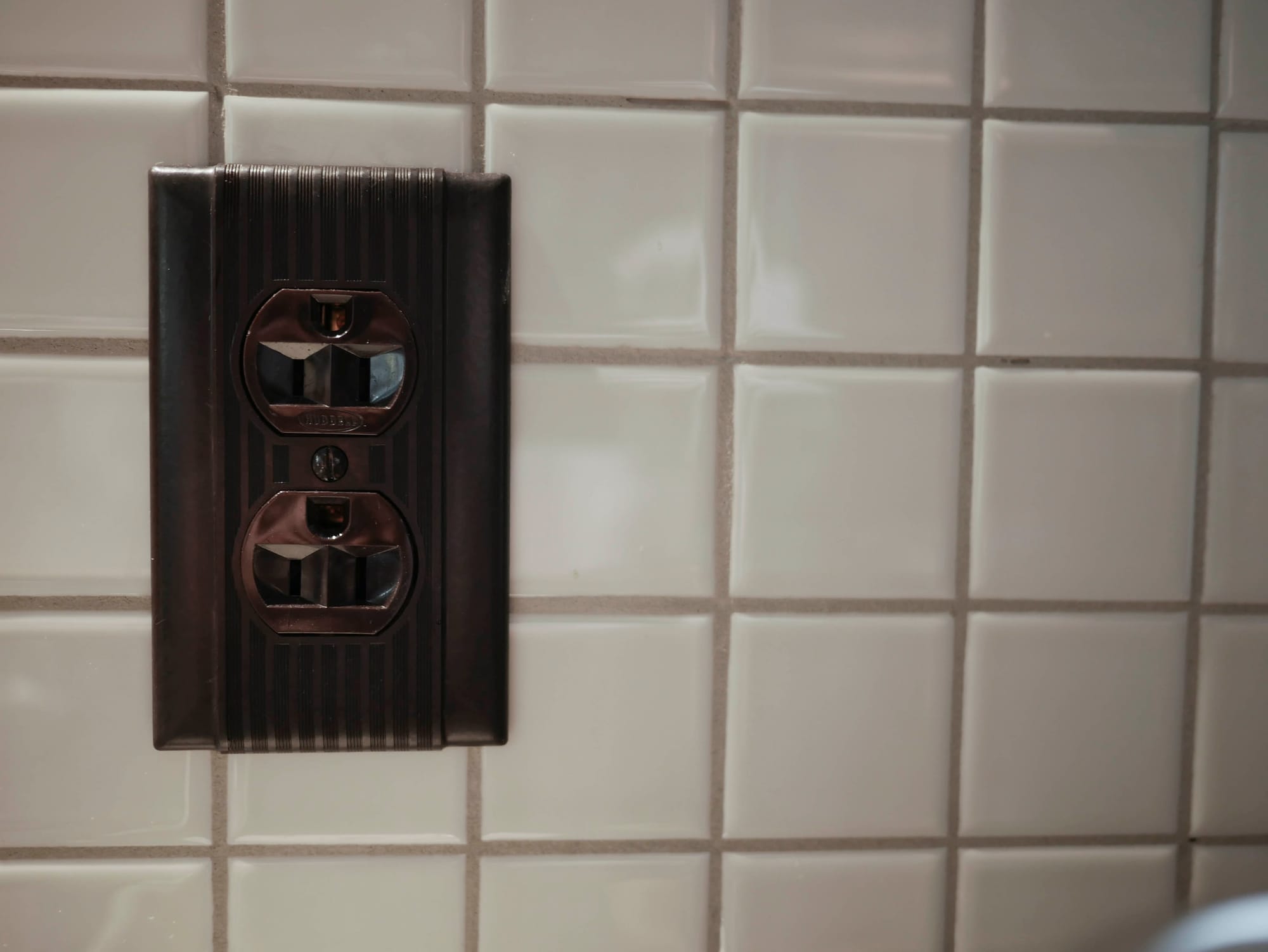
It's subtle, but it exploits the human eye into looking at what's worth looking at.
Yes. We're always Like This.
So what about the "industrial" part of the aesthetic?
Ah, right, we had originally described our kitchen as being "goth industrial grandma". I believe we've touched on the grandma, hinted at the goth, but where's the industrial?
We have a distrust for modernism, and believe that the objects we interact with should be long-lived members of our lives. From cars, to desk fans, to computers, there's a weak aesthetic consideration of 'old things', but moreso a draw to what was built to last—reuse and repair are first principles, initially born out of necessity, but now as an act of resistance to the growing churn of landfill fodder and consumerism.
Given that, we wanted to try our hardest to source our appliances second hand, and not necessarily for budget reasons. Unfortunately, the 1997 Subzero 550 fridge we sourced first as the stainless steel design anchor for the kitchen, ended up being a massive (and costly) mistake. The tragedy of the Subzero deserves its own separate post (which is forthcoming!), but once it was 'in our hands' a new problem we hadn't considered cropped up: we had to find other appliances that generally matched its aesthetics. We were running out of time at this point to source anything, and were quite leery of reliving the pain of transporting and storing anything second hand again...
So what exactly were we looking for?
The visual parameters were: they had to be completely brushed stainless steel, and have bold round handles to match the fridge.
The functional parameters were: dishwasher had to have a stainless tub, the range had to be natural gas and 32" wide, and both had to be as dumb as possible.
We should point out the looming fact that we were running out of time again—we really did not make this easy on ourselves. After several weeks of fretting, we found a matching Frigidaire set of a dishwasher and range, then later found an open-box range hood, thankfully ending up with a relatively cohesive stainless steel appliance pairing.
Other pops of industrial come in the form of the Diehl countertop fan (taking the place of the ceiling fan we once had), cast iron floor register, and our collection of new and vintage Bialetti Moka Pots. I'm sure we'll add even more as we continue to style and fill out the space.
Hopefully you're not sick of this yet!
We realize most people would just write one blog about their process and be done with it, but we feel that would not do our need for detail, nor this project as whole, justice. This is part two of a likely four plus part series documenting a major renovation that the bulk of which spanned nearly a year, and is still ongoing!
In the next (full) part, we'll talk demo & DIY: what we did to save money, what the space looked like through different phases, and what went wrong.
The next post will actually be Part 2.5, the promised recounting of our harrowing tale of buying a Subzero sight unseen. Stay tuned!